Table of Contents
There are situations in which a listview might seem to have too much of information. So I have built a custom list view component which is the customized version of the standard list view aura component.

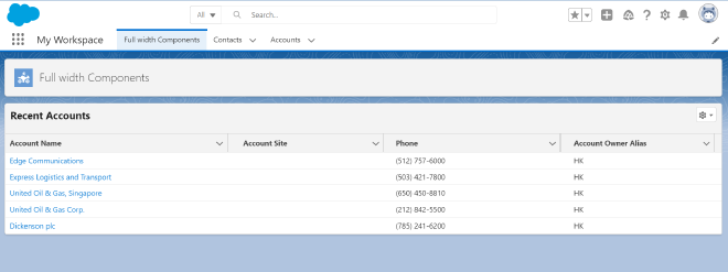
As shown in the image, the minimal list view removes most of the elements from the standard list view. It has a custom title, and an option to reset the width of the columns if altered by the user.
Now let’s jump to the coding part. If you already know how to create aura components in VS code, you can proceed with creating one and skip to this section.
Creating an Aura Component
- Press
Ctrl+Shift+Pand type aura - Choose SFDX: Create Aura Component
- Provide your desired filename (minimalListViewAura in this post) and press Enter
- Provide the desired directory or just press Enter again
- Now the Aura component has been successfully created and ready to be built and customized.
Building the Minimal list view component
Copy the code into the corresponding files.
minimalListViewAura.cmp
<aura:component implements="flexipage:availableForAllPageTypes" access="global">
    <aura:attribute name="object" type="String" default="Account" />
    <aura:attribute name="listName" type="String" default="Recent" />
    <aura:attribute name="listTitle" type="String" default="Recent Accounts" />
    <aura:attribute name="rows" type="Integer" default="5"/>

    <div style="position: relative;">
        <h2 id="custom-list-title">{!v.listTitle}</h2>
        <lightning:listView
            objectApiName="{!v.object}"
            listName="{!v.listName}"
            rows="{!v.rows}"
            showSearchBar="false"
            showActionBar="false"
            enableInlineEdit="false"
            showRowLevelActions="false"
        />
        <br />
    </div>
</aura:component>
minimalListViewAura.css
.THIS .infinite-loading,
.THIS force-list-view-manager-status-info,
.THIS force-list-view-manager-button-bar,
.THIS .forceListViewSettingsMenu .slds-dropdown__header,
.THIS .firstHeaderRow {
    display: none;
}

.THIS .errorColumnHeader,
.THIS .errorColumn {
    display: none;
}

.THIS .forceListViewSettingsMenu {
    position: absolute;
    top: 5px;
    right: 10px;
}

.THIS .forceListViewSettingsMenu button {
    height: 27px;
    width: 35px;
}

.THIS #custom-list-title {
    position: absolute;
    top: 7px;
    left: 10px;
    z-index: 10;
    font-size: large;
    font-weight: bold;
}
That’s it! The minimal list view component is ready to be deployed to org.
- Right click on the component folder and choose SFDX: Deploy Source to Org
- After successful deployment, open the Org in Salesforce and on the desired app page, click on Edit Page option in the Gear icon at the right top of the page.
- As soon as the Lightning App Builder view has loaded, search for the component(minimalListViewAura) which we just deployed
- Drag and drop the component to the app page.
- The component fetches recently viewed accounts from Account object and displays the top 5 rows by default.

Using Minimal list view inside another aura component
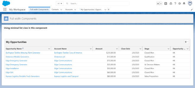
The component which we now created can be injected into other aura components and reused for listviews in other objects. For example, if you want to view My Opportunities as a minimal list view inside another aura component, insert the following code at the desired section inside your component.
<c:minimalListViewAura
    object="Opportunity"
    listName="MyOpportunities"
    listTitle="My Opportunities"
    rows="7"
/>

